Welcome to Xiled Gaming
Wanting to join the rest of our members? Feel free to sign up today.
Sign Up Now
BANNER REQUESTS ARCHIVE 12/02/11 - 08/04/13
- Thread starter KoG Remix
- Start date
You are using an out of date browser. It may not display this or other websites correctly.
You should upgrade or use an alternative browser.
You should upgrade or use an alternative browser.
- Status
- Not open for further replies.
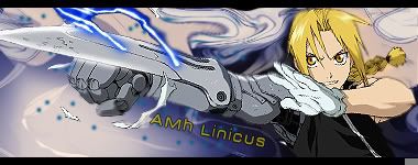
This is by far my favorite signature from you. You did an excellent job.
On this one, try blending in your render a little more to the background (Specifically around the elbow). take a small, soft, round brush and lightly blur the edge of your render. Nothing too crazy though, you're just wanting him to blend a little more. Also, try to apply the depth that you've learned to this signature as well.
Now it's time for a high-five!
You are doing so much better with your text. I love it. You've come quite a ways, now keep up the magnificent work!!!
Next thing i want for you to do is make a signature using all of the new techniques you've learned, but try not to reference back to the tutorials.
(DONE) KOG THEMIS
(DONE) KoG Themis
Name: KoG Themis
Theme: http://i938.photobucket.com/albums/ad230/gs4l-r8cr/themis2.jpg
Color Scheme: (N/A)
Other Text: KoG Themis & Courage Today, Victory Tomorrow
(DONE) KoG Themis
Name: KoG Themis
Theme: http://i938.photobucket.com/albums/ad230/gs4l-r8cr/themis2.jpg
Color Scheme: (N/A)
Other Text: KoG Themis & Courage Today, Victory Tomorrow
Last edited by a moderator:
[PENDING] KOG JEHUTY APPLICATION
[PENDING] KoG Jehuty Application
1) KoG Jehuty
2) Gimp 2.8 with add-ons such as video injectors etc.
3) I have learned quite a fair bit since I became aware of Signitures back when I first started in XGC Darkages which was two year ago, and I enjoy every project I get to to.
4) Freelancer because I don't want to leave my clan.
5)


Last edited:
TEST IMAGES
Test images
This one i wanted something different with text but i accidentally exited before saved with the font, and didn't wanna start all over

----------------------------------------------------------------------------
This one might be a little morbid but it was fun, i know the idea was done before i seen and always wanted to try it

Test images
This one i wanted something different with text but i accidentally exited before saved with the font, and didn't wanna start all over

----------------------------------------------------------------------------
This one might be a little morbid but it was fun, i know the idea was done before i seen and always wanted to try it

Last edited:
The suicide one has a couple things that make it not cool the gun has no fingers so it takes away from the idea making it look like just some random gun shot her instead of suicide another big thing is the red dot on her forehead doesn't fit there at all and distracts from the focal
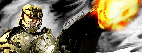
I just did this one for my general like a few hours ago. I went back a re edited the time frame of the fade ins and out.


Last edited:
Thank you for submitting an application. Things are busy here in XDC, and I apologize for the lack of response to your application, but I promise you we've seen it. I'd like you to do a few test images, located in the application thread. It better helps us asses your abilities. Good luck!
you seem to have a decent handle on animation so far. id like to see some different sigs from you though. maybe some sigs with one focal and some simple effects? right now yours are cluttered. remember to do the test images weekly & good luck!
Submission one from samples:

This is also where I got my sample background to see what alterations I have made:


This is also where I got my sample background to see what alterations I have made:

I like what you did to the sky and also that you kept it simple but the colors of the sky and of the render don't match at all. I would suggest taking a couple colors from your focal and building the background with those.
Submission 2:

Wasn't sure if were only meant to do 500x200 or not but I did my own thing this time.
Sample:

Also I am reading the feedback and taking in your input, I will not reply so I won't clutter it up with me chatting.

Wasn't sure if were only meant to do 500x200 or not but I did my own thing this time.
Sample:

Also I am reading the feedback and taking in your input, I will not reply so I won't clutter it up with me chatting.
Last edited:
lol, don't worry. Please do comment back, so we know what you think and understand. This is a chattable thread, as long as it's on topic. Your last one, I would have pulled some of the green from his jacket out, and it looks like you squished him!! always try to not squish the render.
as far as sizes, do what you want, though in the real world, you'll have requirements to stay within. Almost all my sigs are 400x150, it's a size that suits my style.
Also try to sharpen him, he seems blurry and out of focus.
I see your thought process and I like it. Keep it up, and work on basics. You always want the focal to be the best part, and remember, the entire image DOES NOT have to fit in the sig!
Thank you for your request. A design member should be able to help you within a decent amount of time. You will be informed when this is completed. Please allow up to 3-4 weeks for completion.
Are you wanting to continue this app? is so, you need to start doing test images again. Inactivity for 3+ weeks will result in deletion of this app.
Are you wanting to continue this app? is so, you need to start doing test images again. Inactivity for 3+ weeks will result in deletion of this app.
- Status
- Not open for further replies.


