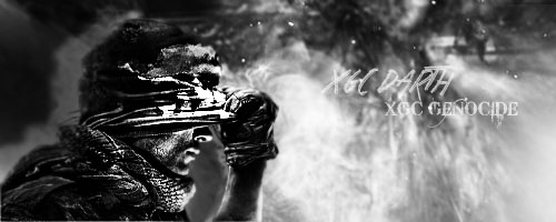
Okay, so I took your critiques and here's what I got for the Ghosts Render. I'll get cracking on the other three.

I like your choice of going for the black and white look but I must say, your render looks to be just a tad bit over sharpened. Sometimes I like to duplicate the render layer, sharpen the duplicate, then set the opacity down.