I feel the opposite. The flow is straight forward so it is good to have him centered in the sig, and also I feel that sometimes simple is better. I do feel a different, cooler colored c4d should have been used in the background
Welcome to Xiled Gaming
Wanting to join the rest of our members? Feel free to sign up today.
Sign Up Now
NOOO ITS YETI APPLICATION
- Thread starter nooo its YETI
- Start date
You are using an out of date browser. It may not display this or other websites correctly.
You should upgrade or use an alternative browser.
You should upgrade or use an alternative browser.
ty and ya I will post more the reason I stopped for awhile was I had stuff going on and no1 was critiquing my work, so I felt why bother.. Also i could careless about a banner. I am already in a design clan just would be nice to show I am in a design clan and actually do design. I will put more up I have been working on 3 right now a couple for friends and most of them actually using the test images. More stuff will be up tonight hope you enjoy.
pp and btw green is technically a "cool" color on scale.
cool:
purple
blue
green
and any variants of them
warm:
red
orange
yellow
pink
and any variants of those
neutral:
white
black
gray
or any color that is a an exact 50/50 mix of a warm and cool color
cool:
purple
blue
green
and any variants of them
warm:
red
orange
yellow
pink
and any variants of those
neutral:
white
black
gray
or any color that is a an exact 50/50 mix of a warm and cool color

so here is a banner that I made for a design forum that does SOTW and bSOTW so i put this in bSOTW for the them music. I know it is not my best work but for the theme I thought it fit and for who Willie Nelson is, the tyedye and smoke I thought fit.
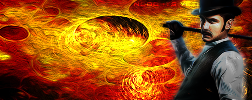
here is the test image of Dr. Watson. I went a different route with this one from my last ones. Kept it simple as Dr Watson is very simple and straight forward. I will attach some of the files I used as well so you can see what the looked like before i did what i thought looked good. As you see I tried to go for the oil painting look as it was a very popular style of painting my main british artists.


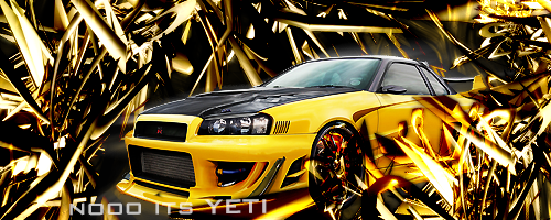
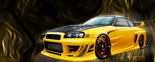
okay so I did two for this... TBH I dont care for doing sigs with cars as there really is no good "theme" to work with or IMO nothing to make it stand out except using a ton of god awful C4Ds... and mostly distracting crap around. soo I did one that is what every is looking for for IMO when they ask for a car sig and one that if I was to use it how I would do it so the car stands out and is actually displayed like it would if on a cover or something. a simple BG and motion blur that it is.
1.
2.
1.

2.

pp and btw green is technically a "cool" color on scale.
cool:
purple
blue
green
and any variants of them
warm:
red
orange
yellow
pink
and any variants of those
neutral:
white
black
gray
or any color that is a an exact 50/50 mix of a warm and cool color
i know green is a cool color. i meant cooler, like blue or purple lol

i love the idea of it, and it looks pretty good, but i wish the texted pooped a little more. one way i do this is to duplicate the layer, and put a black outer glow effect on the bottom text.

i really like this one, but feel that the oil paintmight be to strong (thats more personal though)

i like this one more than the second one. if you do this again try blurring the c4d in the back a little more so that it shows some more depth.
I mean if you really want I can put poop shadowing.. but i think i might look crappy HAHAHAH
Last edited:
I mean if you really want I can put poop shadowing.. but i think i might look crappy HAHAHAH
don't push it...lol
but I am glad you like what I have been posting and I will take the comments and use those towards the next sigs I use. I am trying to learn how to make a GIF avatar and use sigs the move
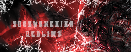
So here is a sig I made for my friend in XDC. I decided to start actually using my brushes for adding style and more detail etc etc instead of just using to smudge lol hope you guys like and I will try to start using more test images from here but I have been on a design forum and they have sooooooo many cool renders and image packages open to the members that I can not help but DL them and use them lol. Hope you like and critique please so I may take your advice and use it on my next signature. As I am not going to re-do any sigs since that does not show I am improving from your advice only doing what you said to do on this which again does not show improvement in my opinion.
Last edited:
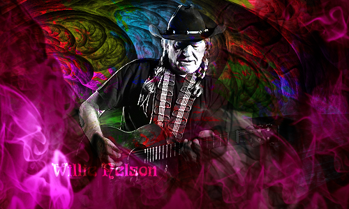
so I fixed my willie nelson sig for the bSOTW competition on a design forum figured I would show you peeps what it looks like.
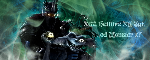
So I went into pending Sig requests and figured lets try one out and see if you guys like what I would have done for them. So here it is let me know what you think
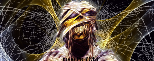
Okay so I had my Lt. pick a random render/picture for me to use in a sig and he gave me the Iron Maiden mummie. This is what I did with it. Also please I would like to get critiques on the ones I have posted recently. I know people are busy but I feel like I might be wasting my time applying as no1 is responding to the post I make and I know two of the people on the design team cant as they are my general and my old general so it would seem bias. But please critique me I am not going to get any better if no1 tells me what i should be working on.