Hi! I'm Austin. Allow me to help you in this journey.
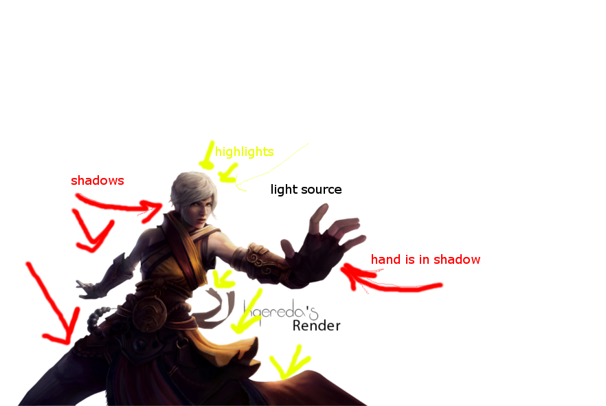
First, I see your thought process with the glow effect on the render; however, I think it may have missed the mark. Please see the attached diagram of the light shadows found in the render.
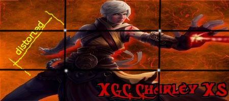
Secondly, it appears that the render may have gotten stretched during the resizing, causing it to look a little skewed. Many programs have a lock option to keep them in ratio format. Most of the time, you can utilize the "shift" key to obtain the same effects. You do not always need to use the entire image in the signature.
I'd like you study a photography concept called "the rules of 3" (or "rules of thirds", depending on where you find it). In a nut shell, it states that they way a Human's eyes analyze an image, it divides the image into sections, approx. 1 third at a time. The philosophy is that key items should fall on these parts, as it's a natural area the eye is drawn too, and seems more pleasant in the translation to your brain (the human body is fascinating!).
Focal points and text that fall on these intersections create a more thought out image.
Thirdly, harsh lines on renders make it seem like images do no belong, and we want to avoid this, as we're trying to create a seemless, cohesive piece of artwork. Sometimes, just taking a small smudge tool or blur tool to the outline can soften the render, and make it feel more a part of the image itself.
I'd like to see you remake this image with the advice given.
Thanks,
Radio.


